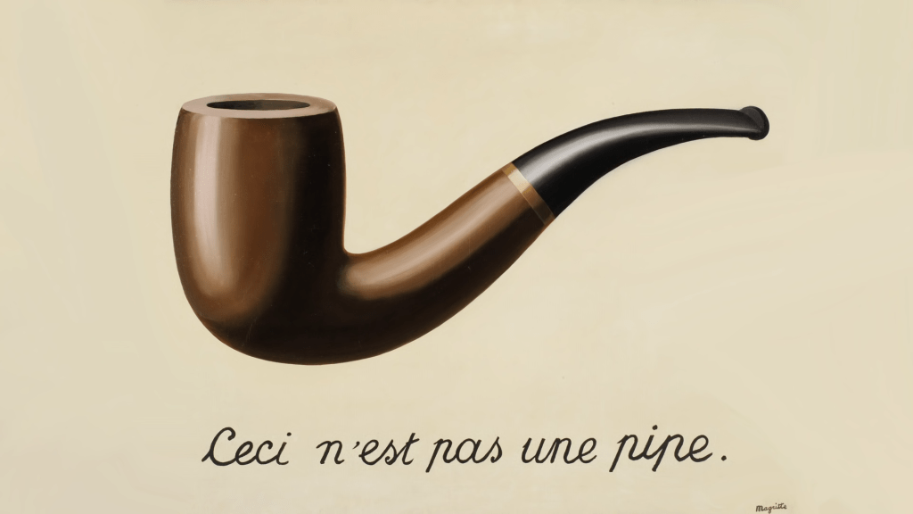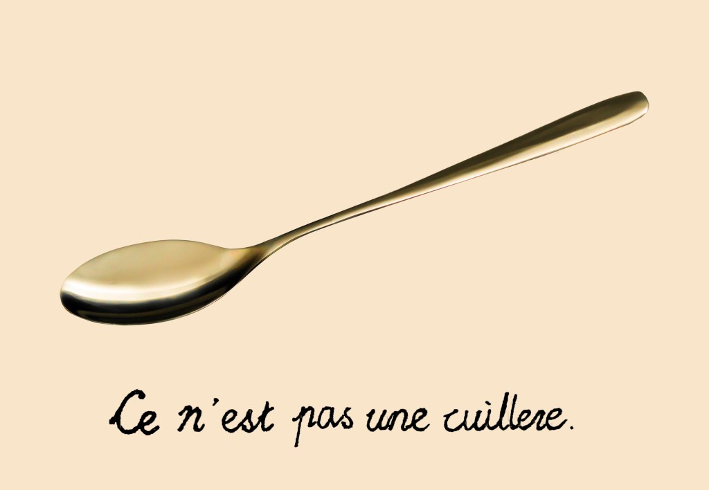
I use the exact same reference in Framework #1, The Treachery of Images by Belgian surrealist painter René Magritte.
I always find it challenging and meaningful to ask myself, “what can I do to improve?”, especially when I already believed I have done a good job. The process involves shattering my self-esteem into pieces and rebuilding everything which I thought was “right.”
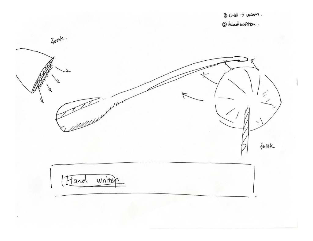
Why cold colour temperature? The blue tone has no connection with neither the reference image nor the inspiration from The Matrix, then why should I make the background blue? Why use a preset text font instead of handwriting?
In this new version of This is not a spoon, I replace all the cold colour temperature lights with warmer colour temperature ones. It not only makes the remake more similar to the original artwork but also gives viewers more feeling of a “daily and cozy life.” I believe rather than using a colder colour temperature to calm down the viewers, it is more surprising if the image delivers a sense of familiarity to viewers. I want the viewers to feel more about the tacit moment when they start to question a thing that is closely around.
Using handwritten text will leave a greater impression on viewers compared with digital fonts. What surprises me when I review this work is the strength brought by the jagged edges around each character. Each character seems to penetrate the paper.